tickettown
User Research
UI/UX design
Wireframing
Prototyping
Iterating
ROLE
ME
MYSELF
I
TEAM
September 2023 - October 2023
DATE
8 WEEKS
DURATION
FIGMA
adobe xd
PHOTOSHOP
ILLUSTRATOR
TOOLS
the problem
Many screenings for movies have empty seats because cinema goers are unaware that there are other places and smaller cinema houses playing a film. Some cinemas dont have dedicated apps and due to storage restrictions, cannot download multiple to use.
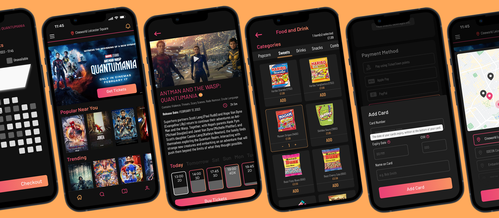
the aim is to Design an all in one app for cinema houses to allow users to easily find cinemas within their chosen area and purchase tickets to watch their desired film conveniently, helping disadvantaged cinema locations to garner an audience.
user research
I CONDUCTED an Unmoderated Usability Study WITH 5 people SO I COULD FIND OUT FIRST HAND WHAT THEIR INDIVIDUAL EXPERIENCES were in regards to buying tickets for films. my selection INCLUDED:
🎓 a recent graduate
🤰 A mother of 3
🏪 a small business owner
😊 AN ADULT LIVING INDEPENDENTLY using assistive tech
🛬 a person whos just moved to the uk
✶ Can users complete a ticket purchase starting at the homepage and ending with the ticket confirmation page?
✶ Do users understand how to purchase for their specific chosen venue?
✶ Do users think that the website is easy to use?
✶ Are there parts of the flow that users tend to get stuck at?
✶ Are users able to navigate the site easily?
Research questions
basic script
pain points
storage
Users didn't have enough space on their phones to download lots of apps for cinemas, so stuck to one and didn't check others if a film was unavailable.
awareness
Users would forget the dates of release for films they had previously shown interest in, or would not know if a certain cinema was screening it.
ui
Some app interfaces were hard to use, preventing users from easily completing a purchase.
time
Users didn't have time to scroll for a long time through the applications.
Key pain points
People want clear form entry designs.
✶ 2 out of 5 total participants had problems identifying text entry areas.
✶ 3 out of 5 total participants had trouble deciphering sections in the checkout form.
“There were some sections where the text where you were expected to write something looked like a header or a divider, i think these could be differentiated for a clear and fast process”
- User Two, participant in test study
People want filtering and search options
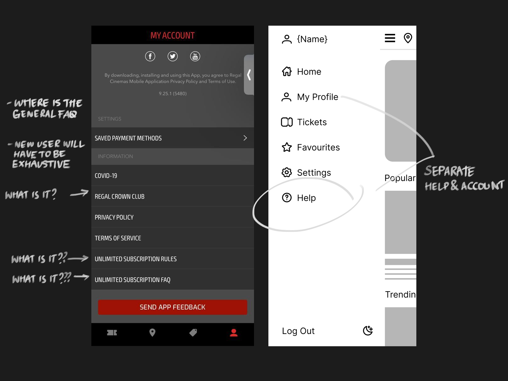
✶ 3 out of 5 participants decided to find the cancellation FAQ using an exhaustive approach.
✶ 3 out of 5 participants spent a long amount of time scrolling through the movie listing.
“Okay, i'm not sure where the search button is. Is there even one? I'm lucky that was at the top, this list is not in alphabetical order at all is it?”
- User One, participant in test study
People want shortcuts to speed up purchases
✶ 2 out of 5 participants found the date slider option useful.
✶ 3 out of 5 participants were able to complete the tasks with minimal issues.
"I like the dates slider, it saves me time having to go all the way to the end of the month every time I load a page"
- User Five, participant in test study
user personas
The busy graduate lisa, 22
“I think the key to enjoy life is a balance of hard work and a good amount of resting and recreation!”
Lisa is a 22-year-old recent graduate trying to break out into the world of design. She’s been accepted as an intern in the field she wants to work in (User Experience), and works at home most days, with 2 days in office at the end of the week. She wants to work on bettering herself and creating a self care routine. She hopes to balance work and fun to make sure she's at optimal creativity levels at the workplace.
Goals
Efficiently purchasing a ticket for a movie to watch. that will be interesting.
Find a cinema branch that is nearby and is also showing.
Needs to be able to find discounts as she is on a budget.
Motivations
being able to enjoy her time outside of office work
bettering her social life balance
being wise about her spending habits
learning about smaller businesses near her she can support
Frustrations
Confusion when entering promo codes – “do I need capital letters or not?”
Search bar implies certain movies will be played when they are not available.
The enthusiastic dad daniel, 35
“I’m always busy marking school work, so I enjoy the little bit free time I can find spending time with my family”
35-year-old Daniel is a busy father of two boys. He is very family oriented, and tries his best to make sure to leave enough time after school to help his kids with their own homework and growth. He spends a lot of time planning lessons and marking work, as he teaches a large class. When he's not working, he’s relaxing watching sports, playing a mobile game, or spending time with his wife and children.
Goals
Purchase tickets for a movie with the seats together for his children
Be able to preview movie trailers and details before buying to make sure they are child friendly
Motivations
being able to treat his kids for doing well in school
finding affordable days out for his family
being organised and responsible with the things he purchases
getting his moneys worth
Frustrations
Has to keep checking back before purchasing because he is unsure of whether he has gotten everything.
Finds it hard to find the number of tickets he needs next to one another.
Some things aren’t clear when the text is too small, so he gets surprised at the grand total.
the design
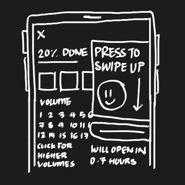
By creating wireframes for the main page i was able to make sure that the design was made in a way that wouldn’t overwhelm the user with elements or text. I prioritised clear and understandable formatting to save time and prevent users dwelling on what text was present for.
digital wireframes and iterations
I continued to iterate the design based on the feedback that I had received as well as user research I was conducting. The earlier designs have been modified to have less clutter on the screen - details such as a synopsis and the title can be read after clicking on the poster. Sections are divided by larger text, and I added a navigation bar to the bottom of the screen.
The usability study revealed that there were issues with the flow of ticket/seat selection page. To make the page flow better, I moved the date and screening time selection to the previous page and added indications for the selected seats outside of the icons.
unused site concepts
it was also my first time using adobe xd, and since i already designed the base for the site on figma, i also tried to create concepts for a website version of the app.
the prototype
the base of the app was finalised in figma. below are examples of the main user flows.
takeaways
learn from those who came before you - existing designs are there to allow us to learn about what was once the best solution to a problem. sometimes by taking these are dissecting them, we can learn abotu new methods in the programs we use and use them to better designs.
figma is really powerful - as i’m learning more and more about how to use the site while designing, i’ve been able to realise that there are just so many resources available for me to use in my designs. remaking assets that i find in order to learn how to build with proper functionality is allowing me to make better designs.
simple can be better - of course, it doesnt mean its always better to make things too minimal, but recognising the type of engagement you want with a certain audience alongside with the right amount of things to catch their attention on the screen at once goes a long way.


